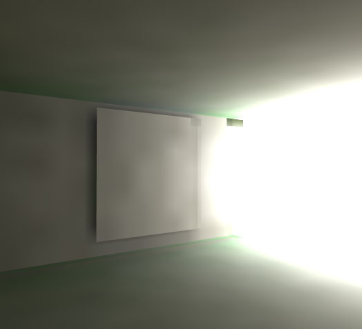
Light map artifact
Remember the artifact visible on the main page - that happens when the image rendered for each patch is too small, and a group of light patches get exactly the same number of very bright pixels from the outside. Then the group of patches next to them which get one more bright pixel appears significantly brighter. You need to find correct size of light patch vs. image rendered for each patch.
As seen by a light patch
Below is an image rendered for one patch. This one is huge - 200 by 200 pixels. It would take ages to render even the simplest scene. You can get reasonably good results even with a 10 by 10 image.
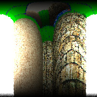
A few points to note:
- The image is distorted because it is rendered onto a sphere. If this image was stretched onto a sphere and you were placed in the centre, it would look correct.
- The image is fuzzy because rays are traced through a random point in each pixel. This is done to reduce artifacts for very small patch images.
- Each pixel corresponds to a different area on the sphere. So there are more pixels for the same area around the edges. This is wrong, so we need to adjust their influence on the scene. That is why the image is darker at the bottom.
- Light rays which hit the surface at nearly 90 degrees to the normal contribute less to the total light reflected by the patch, according to Lambert's cosine law. That is why the image is darker at the top.
- The image looks over-exposed, but internally everything is done in floating-point, so no color clipping occurs.
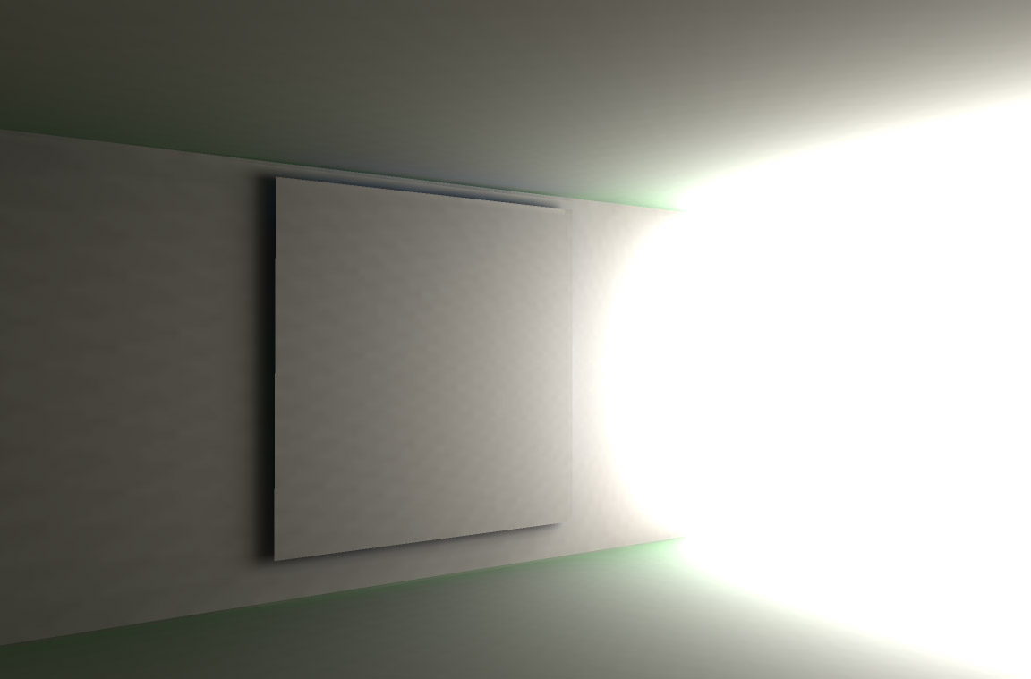
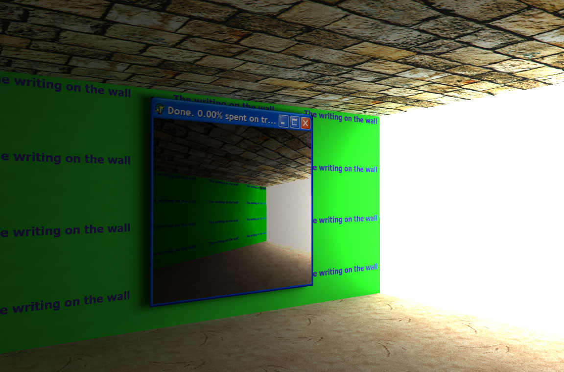
Having done a few passes of radiosity, I switched off texturing and rendered the image below. OK, we knew anyway that things look correct, just because of the brightness slowly fading away the further we are from the opening. But in this image you can see that the green wall is reflecting quite a lot of green light. It's not as pronounced in the textured image, but if you look carefully you'll see it.
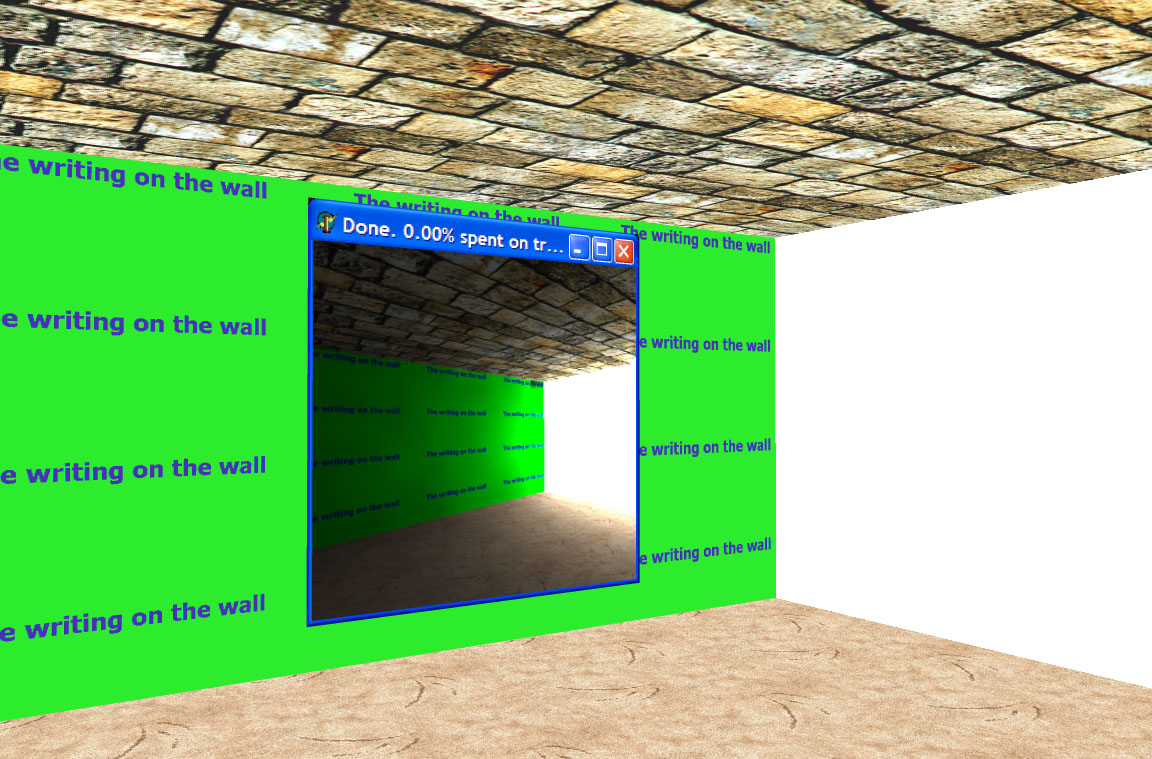
Just see how much realism good lighting adds to the scene. Below is an image of the same scene with lightmap switched off. OK, there are other ways to have a very realistic scene, and the scene I use in this example isn't particularly realistic anyway, but still the difference is enormous.
Lightmap
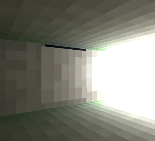
In the image below you can very clearly see the separate light patches. Human eye is extremely good at seeing edges, so bilinear filtering really helps.
Never mind a small bug in my bilinear filtering which causes two light patches to show in a very dark color.
